Reporting templates for clients and executives: 5 pages instead of 50 — what business actually cares about

In 2026, reporting overload is one of the biggest problems in marketing teams. Dashboards grow endlessly, presentations hit 40–60 slides, and yet decision-makers still ask the same questions: Is this working? Why? What should we do next? The issue isn’t a lack of data — it’s a lack of prioritization.
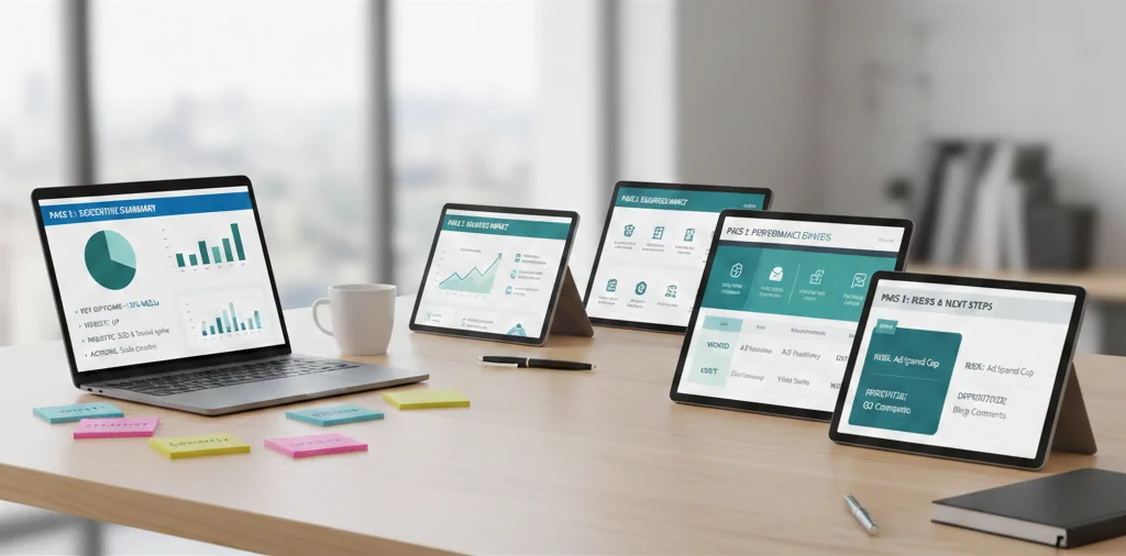
Effective reports for clients and executives don’t aim to show everything. They aim to show what matters for business decisions. This article outlines a practical reporting structure that fits into five clear pages, without losing meaning or credibility.
A unified content calendar helps keep reporting consistent because plans, deadlines, and output live in one place.
Why long reports fail
Large reports usually fail because they:
- Focus on platform metrics instead of business impact
- Mix operational details with strategic conclusions
- Lack a clear narrative
- Require interpretation instead of enabling decisions
Executives don’t need to know everything that happened. They need to know what changed, why it matters, and what’s next.
The 5-page reporting framework
Page 1: Executive summary
This is the most important page.
Include:
- Key outcome vs. goal
- One-sentence performance verdict (up / flat / down)
- 2–3 major insights
- 1–2 recommended actions
If someone reads only this page, they should still understand the situation.
Page 2: Business impact
Translate activity into outcomes:
- Leads generated
- Revenue influenced (if available)
- Cost-efficiency trends
- Funnel movement
Avoid vanity metrics here. Engagement should be included only if it clearly supports business results.
If you need a practical way to connect social activity to leads and revenue, see how to track social media ROI.
Page 3: Performance drivers
Explain why results look the way they do:
- Top-performing content or campaigns
- Key audience segments
- Formats or channels that over- or underperformed
Use comparisons, not raw numbers.
Page 4: What we tested and learned
Executives value learning velocity.
Include:
- Key experiments
- What worked
- What didn’t
- What will change next
This builds confidence that performance is actively managed, not just reported.
Keep the “tested and learned” section tied to real results, using consistent metrics from your analytics setup (see Postoria Analytics).
Page 5: Risks, focus, and next steps
Close with clarity:
- Key risks or constraints
- What you will prioritize next period
- What will be deprioritized
This page turns reporting into action.
What to exclude, on purpose
Remove or move to an appendix:
- Full post-level breakdowns
- Screenshots of dashboards
- Daily fluctuations
- Metrics without decisions attached
If a metric doesn’t inform a decision, it doesn’t belong in the main report.
Why this works for both clients and leadership
This structure:
- Saves time
- Builds trust
- Shows strategic thinking
- Aligns marketing with business language
It also positions the team as decision partners, not data messengers.
Conclusion
In 2026, great reporting is not about transparency through volume — it’s about clarity through selection. A five-page report, when structured correctly, delivers more value than fifty pages of disconnected charts.
When you focus on outcomes, drivers, learnings, and next steps, reports stop being documents — and start becoming tools for better decisions.